Seeing the Big Picture with Public Data
Imagine you are doing a puzzle. You’re working on the top corner, perhaps a friend is piecing together the bottom border and their friend is tackling the always difficult middle area. While each person is responsible for their section, working independently, you’re all looking to achieve the same goal: completing the picture. Now, in my circle of friends it is hotly debated if you’re allowed to look at the box while assembling the puzzle, but we can all agree that it is infinitely easier to complete the puzzle when you can see that big picture. Not only do you then have a baseline of where you want to go, you can also check your progress along the way, making corrections if you’re trying to fit pieces in the wrong places.
At UpMetrics, we view impact measurement in a very similar way. Can you achieve your mission without a view of the big picture and an ability to track your progress to goals along the way? Yes, you probably can. However, when you incorporate these other data points, you will be able to accelerate your progress toward those goals (ie. finish the puzzle faster). You'll also be able to take advantage of what your peers are contributing as they work toward the same goal and pivot quickly when you stop seeing progress.
While you can control what information your impact organization tracks, how you use the data you collect, and how you share your findings, you can’t control what other people are doing. As a result, you may struggle to put the data you've collected into context. This is where public data* can add significant value, informing your strategy and ensuring you stay on track to achieve the impact you set out to achieve.
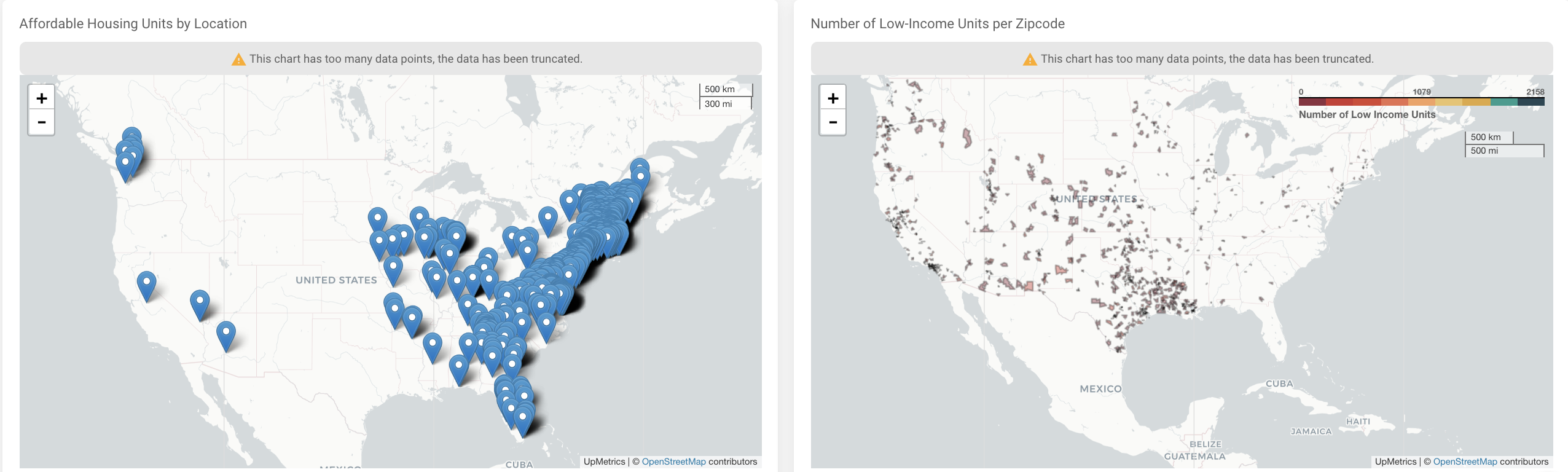
Let’s take a look at this dashboard created by UpMetrics, focusing on public data around affordable housing. The dashboard depicts many pieces of data, which you can filter based on your area of focus. So let’s say you’re looking to decrease homelessness in Chicago. The public data presented in this dashboard informs us that only 12.7% of affordable housing projects target the homeless. Interpreting this data point, perhaps funding a project that increases the availability of affordable housing for the homeless in Chicago could help your organization track toward your goal. Diving deeper into the map of low-income units per zip code, your impact organization can identify where to focus, not duplicating the efforts of other projects supported by different funders. Finally, as you launch your program, you can use this dashboard to see if you’re truly making an impact on a larger scale, not just within your single program.
Another way public data can add immense value to your work is to help you identify patterns, like when putting together pieces of a puzzle. As you find patterns, you shift your approach, using this information to progress toward your goal. For example, many philanthropic organizations added a funding area of focus around COVID-19 relief in 2020 as their communities were under the immense stress of the pandemic. Some formed relief funds, distributing their donations through a single entity. But how do you know where to focus this relief, and that it is going to the areas of your community that need it most?
As this Bloomberg article highlights, public data mapping was able to show that communities that are predominantly Black were hit hardest by coronavirus. It was also able to show a pattern of why.
“Black neighborhoods see more poverty, air pollution, extreme heat and flood damage, and less access to health care and food — all factors that make residents more vulnerable to the coronavirus. The maps are of Chicago, but they reflect the reality of numerous other American cities where coronavirus has devastated communities of color.” Source
What does this mean for funding? It means that to truly track toward the big picture goal of providing support for COVID-19, you need to work at addressing each of the factors referenced above, providing the resources and tools needed. Using public data, funders can see that, pivoting their efforts until they start to see a shift in the data in a positive direction.
For example, connecting back to the affordable housing dashboard, funders can check to see if a lack of affordable housing in the hardest hit neighborhoods leads to crowded homes, where COVID-19 spreads faster. Relief can then be directed toward increasing the amount of affordable housing projects. For more information and a deeper dive into the public data around these areas that cause certain neighborhoods of Chicago to be hit harder than others in the pandemic, I encourage you to read the full article from Bloomberg.
Your organization will be able to maximize impact, ensuring that you’re focusing on the key drivers that will help your progress toward change, with the support of public data. The combination of public data and the data you’ve collected first hand provides insight into the big picture, tracking your progress in real-time and moving your work out of the silo of a single program.
*Learn more about public data in our FAQ's
Learn more about how you can be utilizing public data at your organization by emailing us.